


- Destroy This Mad Brute Pòster
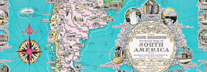
- El bon veí d'Amèrica del Sud Pòster
- Itàlia amb Ciutat del Vaticà Pòster
- Les Lalanne Pòster
- Parella ballant a la neu Pòster
- Jet Clipper a Hawaii Pòster
- Kohler Chocolat Pòster
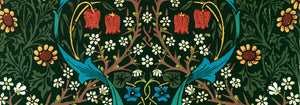
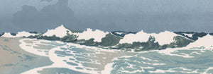
- Strawberry Thief Pòster
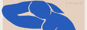
- Figures ballant de Matisse Pòster
- Exposició Tom Krojer Pòster
- Escena de carrer de Berlín Pòster
- Exposició Ernst Kirchner pòster
- Dona asseguda d'esquena Pòster
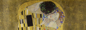
- Cabell vermell, barret blau Pòster
- Parc prop de Lu Pòster
- El Comienzo Pòster
- Parler Seul 2 Pòster
- Anell del crepuscle Pòster
- Parler Seul Pòster
- The Dream Pòster
- Le Concert Pòster
- Dona artista Pòster
- Revenge of the Pink Panther Pòster
- Dona i ocell a la nit Pòster
- Visit Puerto Rico Pòster
- Bauhaus 20 Pòster
- Bauhaus 21 Pòster
- Menja més fruites Pòster
- Grua japonesa blava pòster
- Snoopy Come Home Pòster
- A Londres amb Jet Clipper Pòster
- Crans Pòster
- Monte Carlo Pòster
- Pacific Vibrations Pòster
- Continental Hawaii Airline Pòster
- Cervesa i cigarreta Pòster
- Costa oest de Mèxic Pòster
-
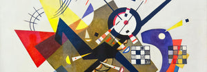
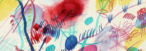
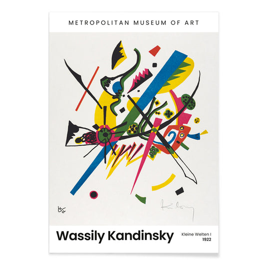
Kleine Welten I Pòster
Wassily Kandinsky · 1922 · Pòster abstracte geomètric que equilibra cercles, línies i brillants accents primaris sobre fons blanc
Poster from €9 · Framed from €16
Regular price From €6,00Regular price -
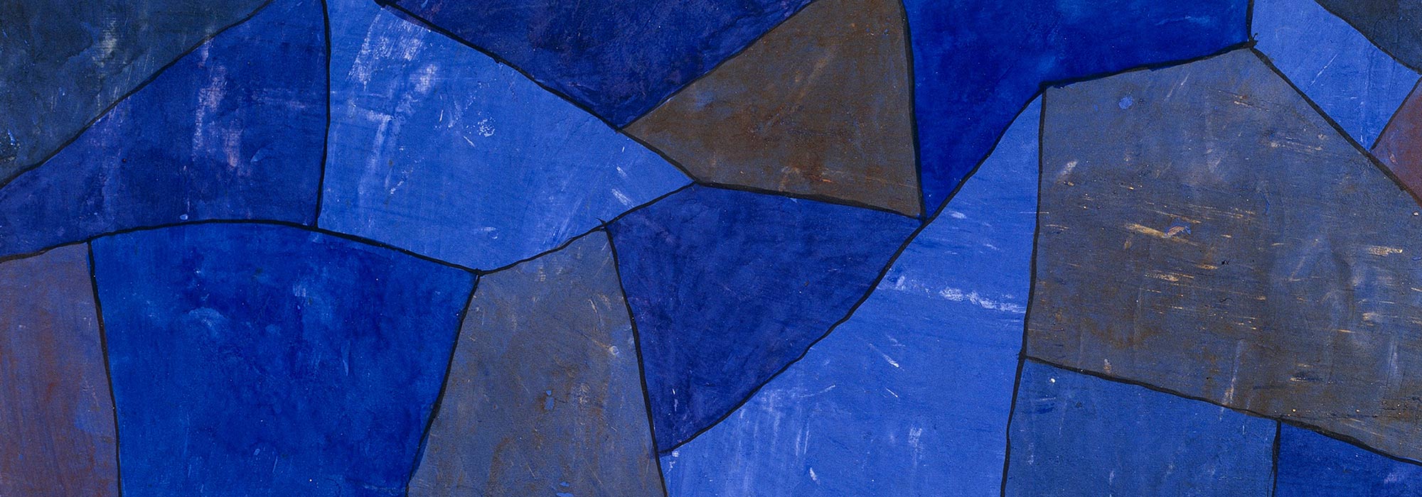
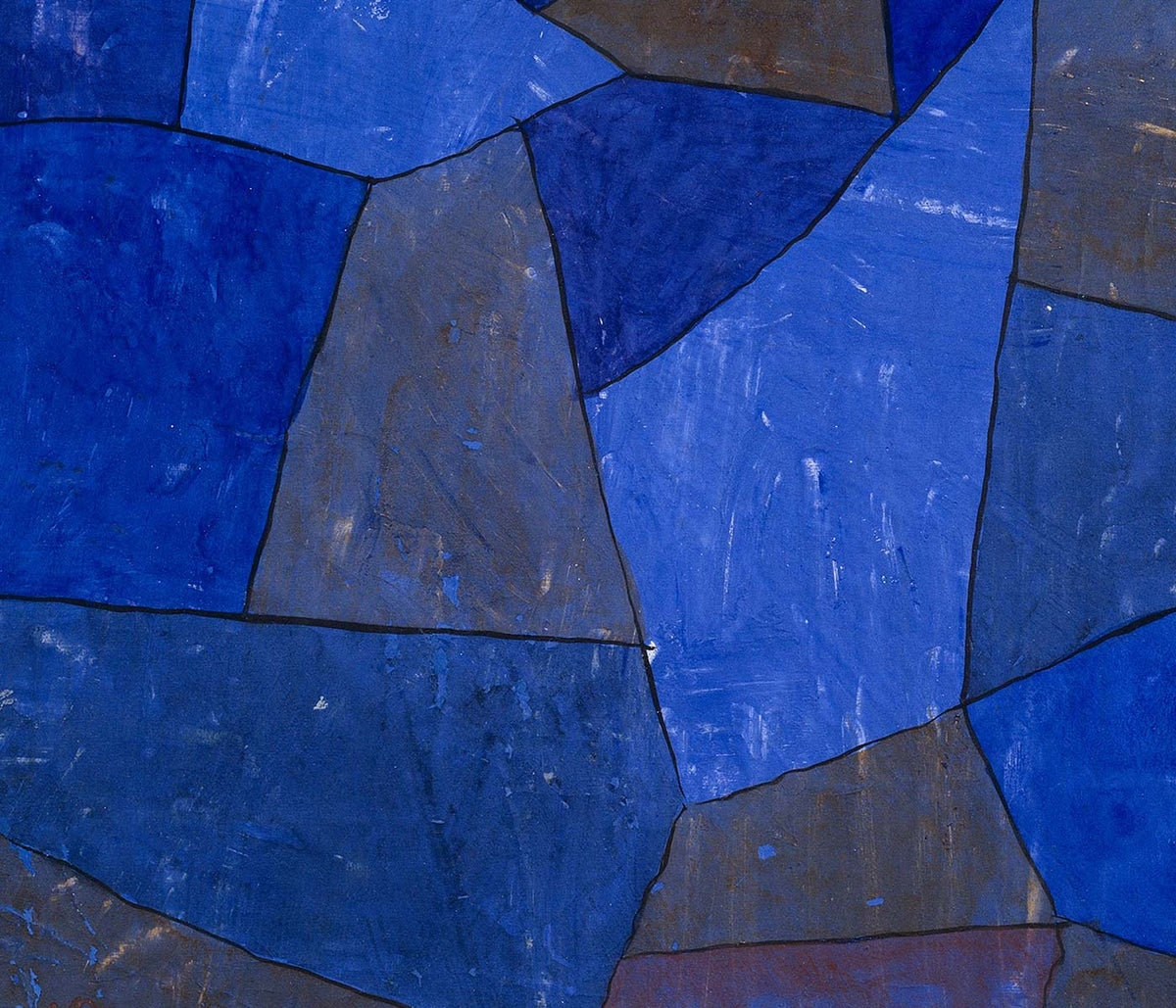
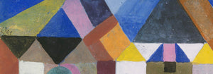
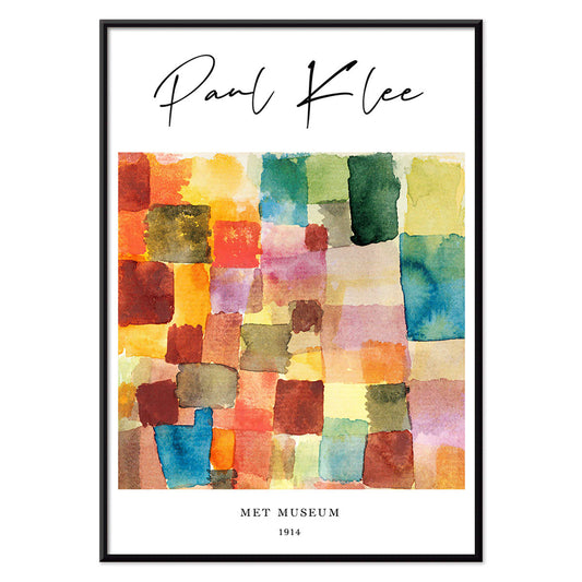
Patchwork de colors Pòster
Paul Klee · 1914 · Impressió d'art abstracta de quadrats patchwork amb vermells i blaus
Poster from €9 · Framed from €16
Regular price From €6,00Regular price -
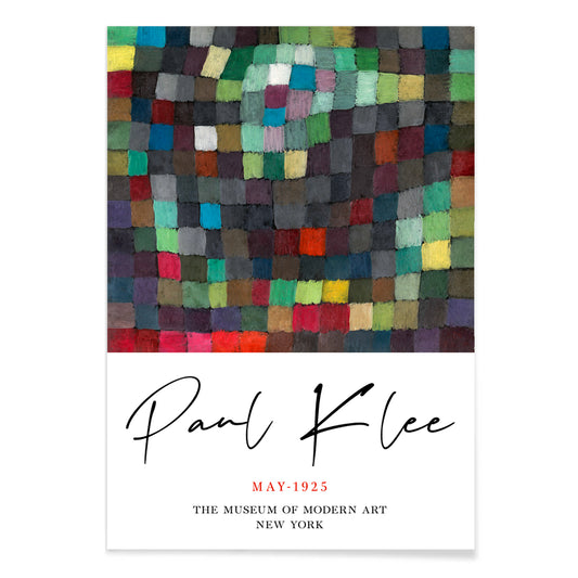
Imatge de maig Pòster
Paul Klee · 1925 · Jocós pòster abstracte amb blocs de color rítmics equilibrats per fines línies negres
Poster from €9 · Framed from €16
Regular price From €6,00Regular price -
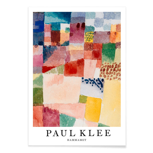
Hammamet Pòster
Paul Klee · 1914 · Radiant impressió d'art abstracta que evoca Hammamet amb mosaics vermell blau i groc
Poster from €9 · Framed from €16
Regular price From €6,00Regular price -
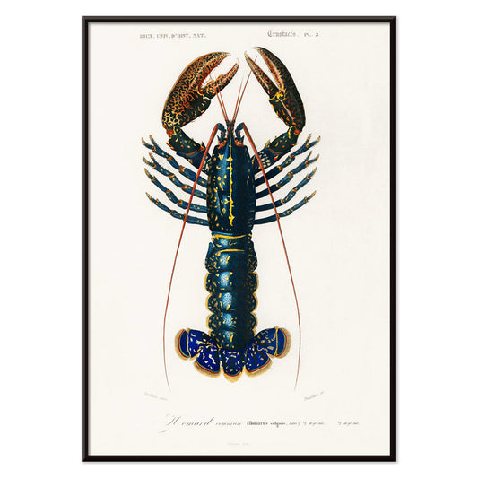
Escamarlà carmí (Palemon Ornatum) Pòster
Charles Dessalines D'Orbigny · 1849 · Impressió científica detallada d'un crustaci carmí amb antenes llargues i traç lineal naturalista
Poster from €9 · Framed from €16
Regular price From €6,00Regular price -
Three Brothers Vaixell clíper Pòster
Charles Parsons · 1875 · Impressió vintage marítima clàssica d'un vaixell clíper a tota vela
Poster from €9 · Framed from €16
Regular price From €6,00Regular price -
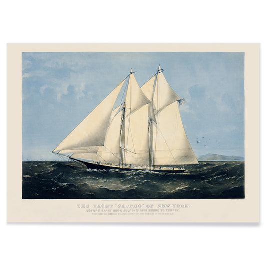
Iot Sappho of New York Pòster
Nathaniel Currier · 1870 · Pòster clàssic de veler amb cordatge nítid i ampli fons marí
Poster from €9 · Framed from €16
Regular price From €6,00Regular price -
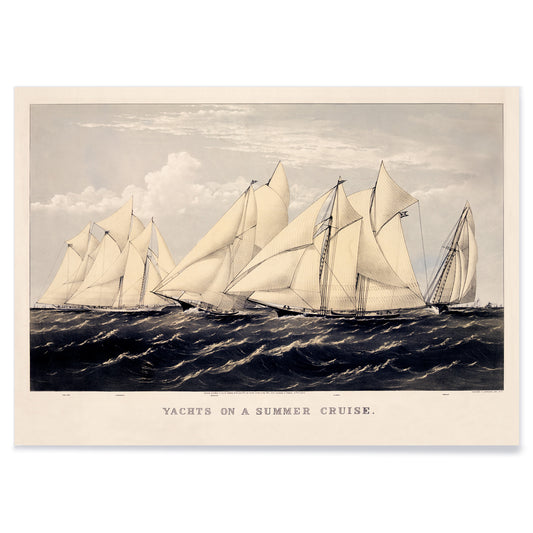
Iots en un creuer d'estiu Pòster
Charles Parsons · 1876 · Pòster de vela viu amb diversos iots navegant sobre aigües blaves sota un cel radiant
Poster from €9 · Framed from €16
Regular price From €6,00Regular price -
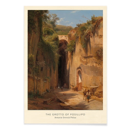
La cova de Posillipo Pòster
Antonie Sminck Pitloo · 1824 · Impressió d'art atmosfèrica de viatgers i animals sota la cova napolitana banyada de sol
Poster from €9 · Framed from €16
Regular price From €6,00Regular price -
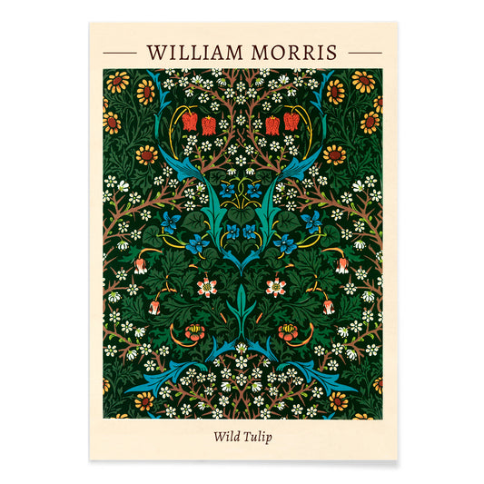
Violeta i aquil·legia Pòster
William Morris · 1883 · Impressió ornamental que entrellaça violetes i aquil·legia en un patró de jardí dens
Poster from €9 · Framed from €16
Regular price From €6,00Regular price -
Calèndula blava Pòster
William Morris · 1875 · Impressió d'art blava i intrincada amb calèndules en patró Arts and Crafts rítmic
Poster from €9 · Framed from €16
Regular price From €6,00Regular price -
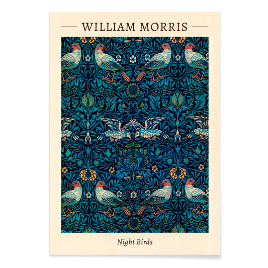
Ocells de nit Pòster
William Morris · 1887 · Impressió ornamental d'ocells nocturns i fullatge entrellaçat en tons blau-verd profunds
Poster from €9 · Framed from €16
Regular price From €6,00Regular price -
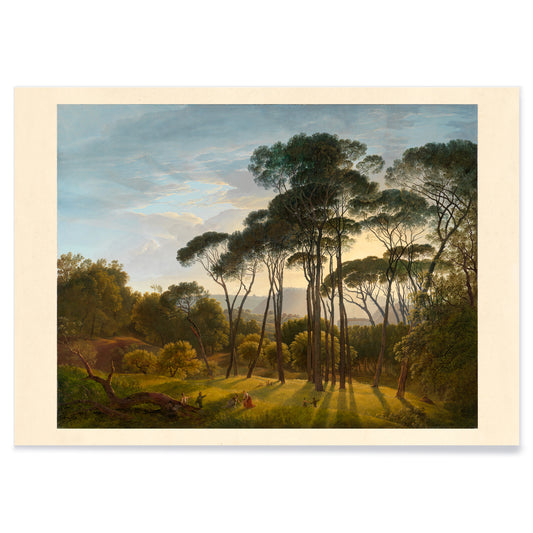
Pins parasol Pòster
Hendrik Voogd · 1816 · Serena impressió d'art italiana amb pins parasol, llum càlida i turons blaus distants
Poster from €9 · Framed from €16
Regular price From €6,00Regular price -
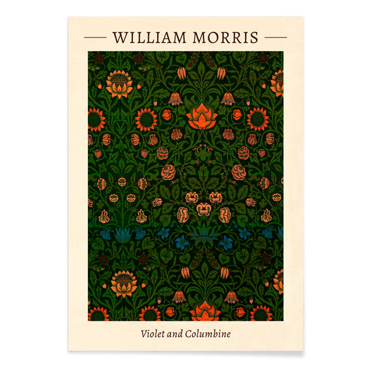
Tulipa salvatge Pòster
William Morris · 1875 · Impressió botànica densa de tulipes i fulles en ritme Arts and Crafts
Poster from €9 · Framed from €16
Regular price From €6,00Regular price -
Limodoron xinès Pòster
Philip Reinagle · 1807 · Elegant impressió botànica Limodoron xinès amb tiges primes verdes i flors d'orquídia delicades
Poster from €9 · Framed from €16
Regular price From €6,00Regular price -
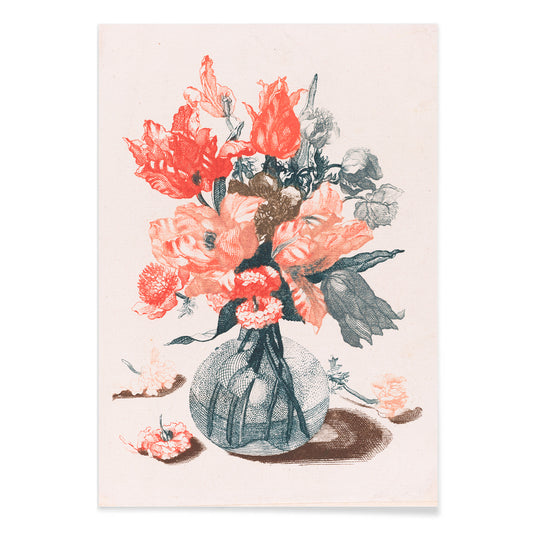
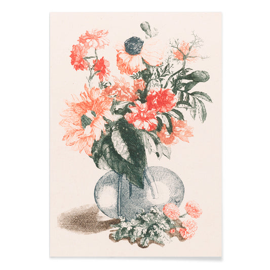
Cinc impressions de flors en gerros de vidre Pòster
Jean Baptiste Monnoyer · 1687 · Elegant impressió floral que mostra cinc gerros de vidre amb rams treballats
Poster from €9 · Framed from €16
Regular price From €6,00Regular price -
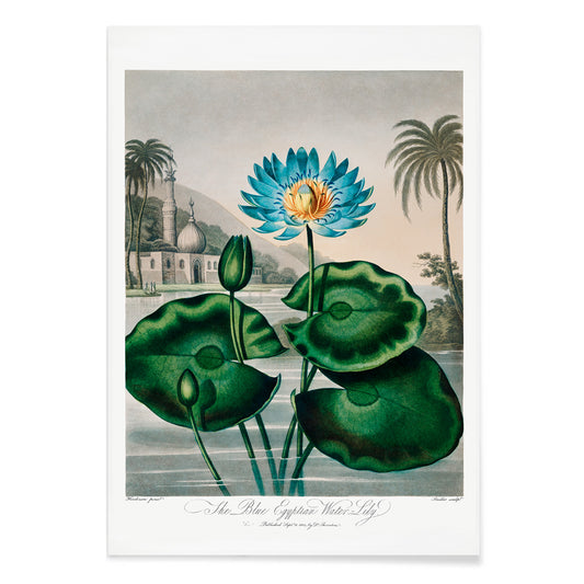
Lliri d'aigua egipci blau Pòster
Robert John Thornton · 1807 · Impressió botànica dramàtica de lliri d'aigua blau amb pètals lluminosos sobre fons ombrívol
Poster from €9 · Framed from €16
Regular price From €6,00Regular price -
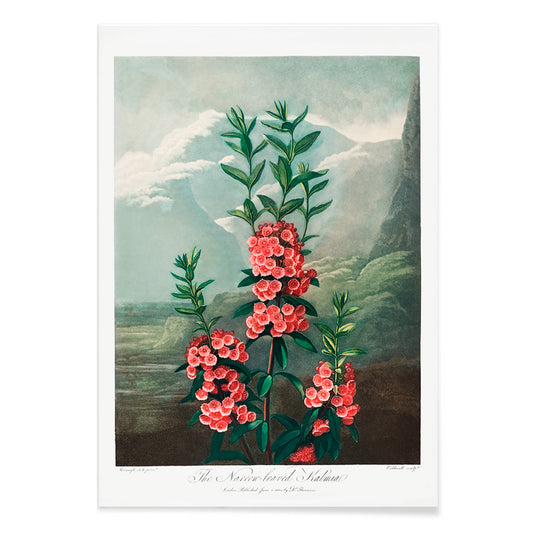
Kalmia de fulla estreta Pòster
Robert John Thornton · 1807 · Elegant impressió botànica de kalmia de fulla estreta amb floracions rosades i fullatge esvelt
Poster from €9 · Framed from €16
Regular price From €6,00Regular price -
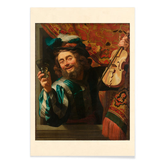
The Merry Fiddler Pòster
Gerard van Honthorst · 1623 · Intensíssima impressió d'art barroca d'un violinista rient amb violí i copa alçada
Poster from €9 · Framed from €16
Regular price From €6,00Regular price -
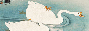
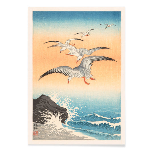
Cinc gavines Pòster
Ohara Koson · 1927 · Impressió d'art shin-hanga de cinc gavines planant sobre ones índigo
Poster from €9 · Framed from €16
Regular price From €6,00Regular price -
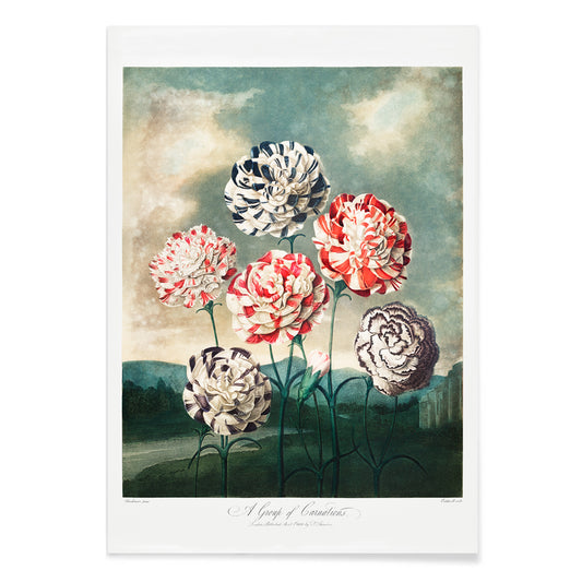
Un grup de clavells Pòster
Robert John Thornton · 1807 · Impressió botànica romàntica de clavells amb vermells vius, verds frondosos i blancs nets
Poster from €9 · Framed from €16
Regular price From €6,00Regular price -
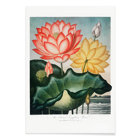
Mongeta egípcia sagrada Pòster
Robert John Thornton · 1807 · Luminosa impressió botànica de lotus amb flor serena, càpsula i fulles flotants
Poster from €9 · Framed from €16
Regular price From €6,00Regular price -
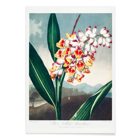
Renealmia inclinada Pòster
Philip Reinagle · 1807 · Impressió botànica dramàtica de Renealmia amb fullatge elegant i detall acadèmic
Poster from €9 · Framed from €16
Regular price From €6,00Regular price -
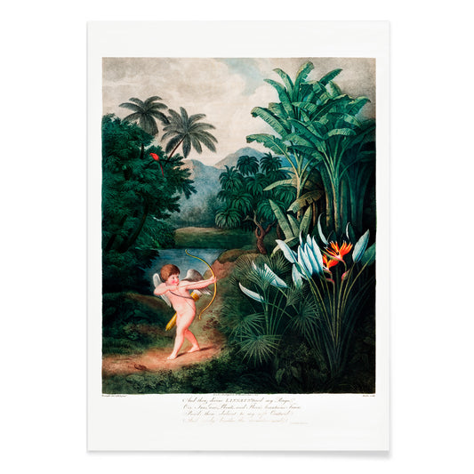
Cupido inspirant plantes pòster
Richard Corbould · 1807 · Romàntica impressió vintage de Cupido entre fullatge tropical i cel lluent
Poster from €9 · Framed from €16
Regular price From €6,00Regular price -
Gerro de vidre amb flors Pòster
Jean-Baptiste Monnoyer · 1670 · Exuberant impressió d'art floral amb ram assolellat en gerro de vidre
Poster from €9 · Framed from €16
Regular price From €6,00Regular price -
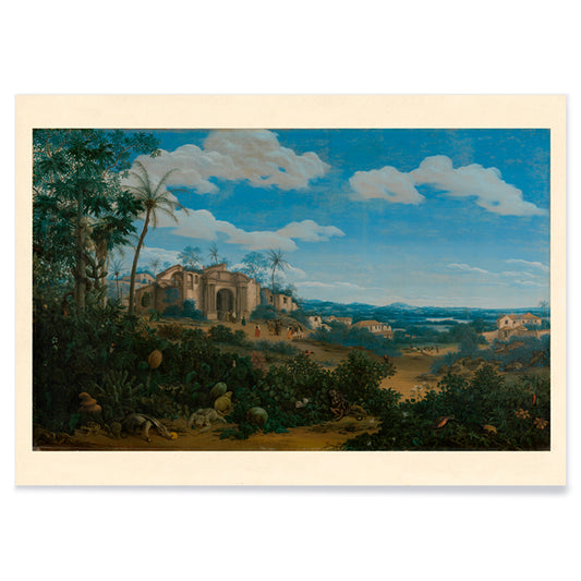
Vista d'Olinda Pòster
Frans Jansz Post · 1662 · Panoràmica costanera d'Olinda en verds tropicals i cel blau airejat
Poster from €9 · Framed from €16
Regular price From €6,00Regular price -
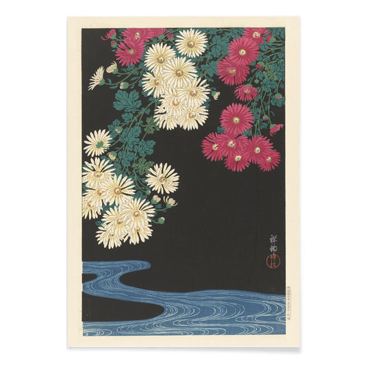
Crisantems Pòster
Ohara Koson · 1912 · Serena impressió de crisantems sobre aigües ondulants en suaus tons rosa i blau
Poster from €9 · Framed from €16
Regular price From €6,00Regular price -
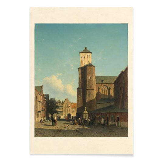
Església de Saint-Denis Pòster
Jan Weissenbruch · 1846 · Impressió d'art d'una plaça assolellada centrada en l'església Saint-Denis
Poster from €9 · Framed from €16
Regular price From €6,00Regular price -
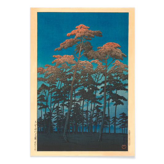
Hikawa Park Pòster
Kawase Hasui · 1930 · Tranquil pòster paisatgístic amb pins esvelts en silueta sobre un vespre blau i taronja
Poster from €9 · Framed from €16
Regular price From €6,00Regular price -
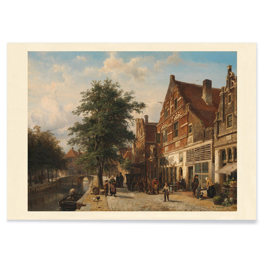
Vista de poble Pòster
Cornelis Springer · 1850 · Luminosa impressió d'art de ciutat holandesa amb façanes nítides, reflexos al canal i figures passejant
Poster from €9 · Framed from €16
Regular price From €6,00Regular price -
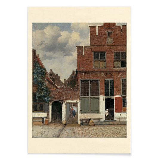
The Little Street Pòster
Johannes Vermeer · 1658 · Serè pòster de carrer de Delft en impressió d'art amb façanes de maó i ombres de portes
Poster from €9 · Framed from €16
Regular price From €6,00Regular price -
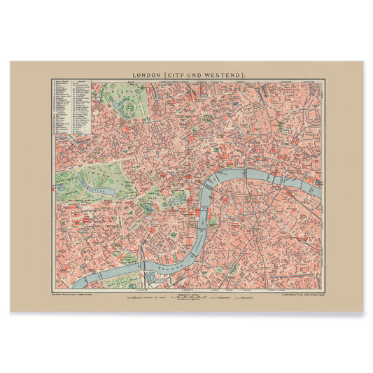
Mapa antic de Londres Pòster
Friedrich Arnold Brockhaus · 1899 · Detallat pòster de Londres amb la Tàmesi i la trama de carrers en tons suaus
Poster from €9 · Framed from €16
Regular price From €6,00Regular price -
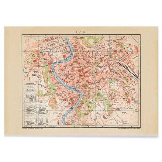
Mapa antic de Roma Pòster
Friedrich Arnold Brockhaus · 1883 · Impressió vintage de Roma detallada que traça el Tíber amb districtes nítidament etiquetats
Poster from €9 · Framed from €16
Regular price From €6,00Regular price -
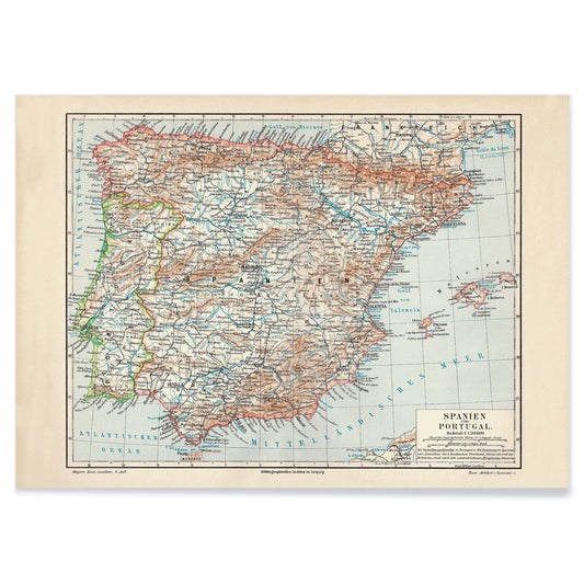
Mapa antic d'Espanya Pòster
Carl Diercke · 1905 · Impressió vintage de la Península Ibèrica amb fronteres regionals i aigües costaneres suaus
Poster from €9 · Framed from €16
Regular price From €6,00Regular price -
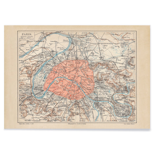
Mapa antic de París Pòster
Friedrich Arnold Brockhaus · 1894 · Detallada impressió vintage del plànol de París amb la Sena blava i límits vermells
Poster from €9 · Framed from €16
Regular price From €6,00Regular price -
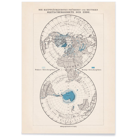
Pols de la Terra Pòster
Friedrich Arnold Brockhaus · 1897 · Impressió vintage de regions polars amb mars blaus i línies de mapa negres precises
Poster from €9 · Framed from €16
Regular price From €6,00Regular price


Blue as atmosphere, not just a hue
Blue rarely behaves like a single color. In vintage poster design it becomes distance, weather, depth, and even time, shifting from Prussian ink to pale sky wash as the subject changes. This collection treats blue as a structural element in wall art decoration: it can cool a room, clarify a line, and make paper feel archival. You see it in coastal imagery, in diagrammatic plates, and in graphic compositions where the blue field is the main event rather than a background. For adjacent moods, the pared-back restraint of Minimalist posters and the tonal focus of Black & White prints offer clean counterpoints.
Indigo, cyanotype, and the modernist sky
Historically, blue arrives through different technologies as much as through taste. Textile indigo moved between craft and industry, while cyanotype made photographic images from chemistry and sunlight, producing that unmistakable blueprint blue. William Morris’s Strawberry Thief (1883) sets rich indigo behind fruit and birds, turning repetition into a kind of domestic architecture that reads as both pattern and pictorial scene. Anna Atkins’s Fern (1850) cyanotype shows how the same color can act as evidence: the plant appears as a precise silhouette, halfway between specimen and lacework. In modern abstraction, Wassily Kandinsky’s Bleu de Ciel (1925) uses blue as a stage for floating signs, linking painting to the era’s fascination with music, science, and mapping the unseen. Related worlds of form and color sit in Abstract and Bauhaus.
Placing blue wall art in a home palette
In home decor, blue is easiest to live with when it is anchored by materials. Warm woods and sandy neutrals keep deep blues from feeling cold, while brushed steel and glass make pale blues feel deliberate rather than decorative. In an entryway, a blue print can act like a visual compass; in a bedroom, it reads as quieter when echoed in linen or a rug. For kitchens, blue beside white tile tends to feel crisp, especially when the imagery is botanical or cartographic. If you want recognizable subjects with blue emphasis, look toward Maps, Sea & Ocean, and Botanical; if the room already has strong color, a simpler sheet from Classic Art can keep the balance.
Curating: rhythm, scale, and framing choices
Blue makes curating easier because it can unify mixed imagery across a gallery wall. Start with one dominant piece, then add one or two quieter companions that repeat its temperature without copying its subject. Hokusai’s The Great Wave off Kanagawa (1830) is an obvious anchor: the wave’s blue is not atmospheric but architectural, built from carved contour and foam, almost like typography. Pair it with Kawase Hasui’s Morning at Cape Inubō (1931), where the sea is reduced to bands and gradients, creating a calmer cadence. To keep the set from becoming too nautical, insert a map plate or an abstract composition as a visual pause. Framing finishes also steer the mood: light oak keeps blues breathable, a white mat gives dark inks air, and a slim black frame heightens contrast; options live in Frames.
Blue as ink, dye, pigment, and data
What holds these posters together is not a single era or subject but the way blue carries information. It can read as craft dye, printing ink, mineral pigment, or scientific notation, which is why it fits rooms that mix ceramics, books, and travel objects without looking staged. As vintage wall art, blue often suggests both the sea and the library: a color associated with horizons and with study. That tension between sensation and structure is the collection’s real thread, and it is what makes blue feel steady in everyday decoration.