


- Cebes Pòster
- Raves Pòster
- Parella ballant a la neu Pòster
- Jet Clipper a Hawaii Pòster
- Campari Soda Pòster
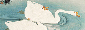
- Bec-Kina Pòster
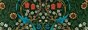
- Strawberry Thief Pòster
- Figures ballant de Matisse Pòster
- Exposició Tom Krojer Pòster
- Escena de carrer de Berlín Pòster
- Exposició Ernst Kirchner pòster
- Parc prop de Lu Pòster
- El Comienzo Pòster
- Anell del crepuscle Pòster
- Parler Seul Pòster
- Faun i Nimfa Pòster
- The Dream Pòster
- Le Concert Pòster
- Dona i ocell a la nit Pòster
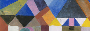
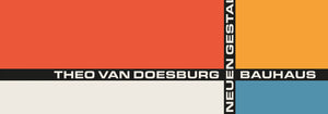
- Bauhaus 20 Pòster
- Bauhaus 21 Pòster
- Menja més fruites Pòster
- Snoopy Come Home Pòster
- A Londres amb Jet Clipper Pòster
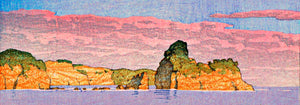
- Kyushu-Okinawa Pòster
- Xerez Pedro Domecq Pòster
- Balsam Aperitif Pòster
- Mantega Pòster
- Crans Pòster
- Monte Carlo Pòster
- Pacific Vibrations Pòster
- Continental Hawaii Airline Pòster
- Gat negre 4 Pòster
- Gat negre 3 Pòster
- Cervesa i cigarreta Pòster
-
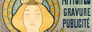
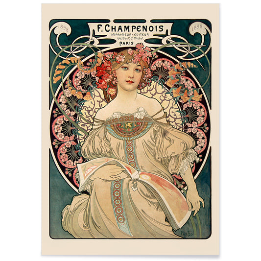
Champenois Pòster
Alphonse Maria Mucha · 1898 · Elegant pòster modernista amb marc floral i tipografia parisenca
Poster from €9 · Framed from €16
Regular price From €6,00Regular price -
Loïe Fuller per Pal Pòster
Jean de Paléologue · 1897 · Pòster serpentina elèctric amb velos grocs que esbaten sobre fons negre
Poster from €9 · Framed from €16
Regular price From €6,00Regular price -
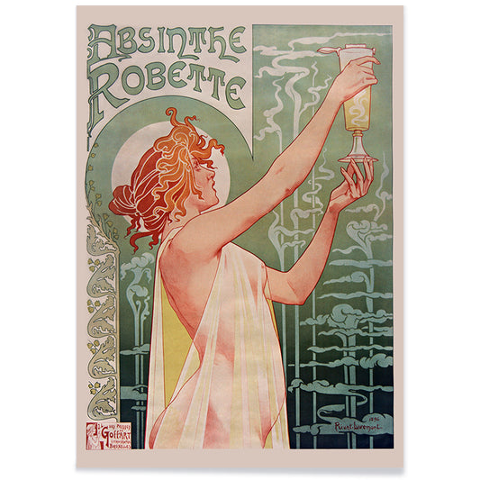
Absinthe Robette Pòster
Privat Jean Baptiste Livemont · 1896 · Pòster Art Nouveau icònic amb una musa rossenca emmarcada per remolins verds d'absenta
Poster from €9 · Framed from €16
Regular price From €6,00Regular price -
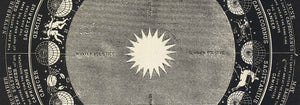
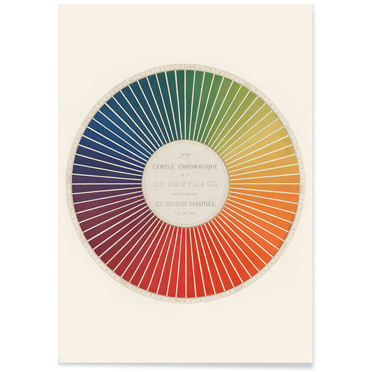
Cercle cromàtic Pòster
Michel Eugène Chevreul · 1861 · Impressió científica clàssica d'un cercle cromàtic amb relacions harmòniques de tons
Poster from €9 · Framed from €16
Regular price From €6,00Regular price -
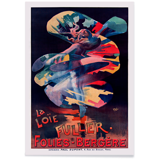
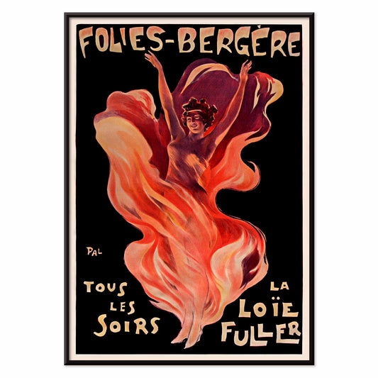
Folies-Bergère Pòster
Jean de Paléologue · 1894 · Dramàtic pòster de Loïe Fuller amb teles ondulants i tipografia de cabaret
Poster from €9 · Framed from €16
Regular price From €6,00Regular price -
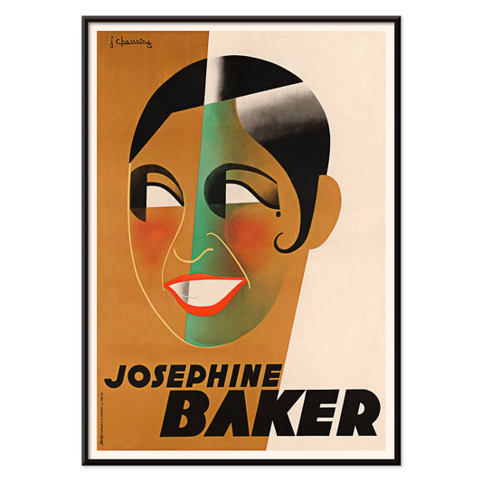
Joséphine Baker Pòster
Jean Chassaing · 1930 · Pòster Art Déco de Joséphine Baker amb geometria audaciosa i ritme de cabaret
Poster from €9 · Framed from €16
Regular price From €6,00Regular price -
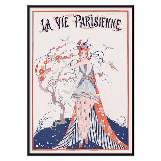
La Vie Parisienne Pòster
Umberto Brunelleschi · 1913 · Chic portada de revista parisenca en pòster amb vestit floral i silueta refinada
Poster from €9 · Framed from €16
Regular price From €6,00Regular price -
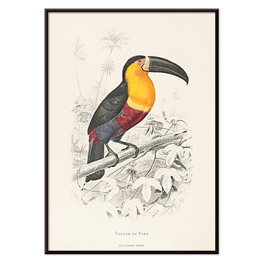
Tucà del Para Pòster
Jacques de Sève · 1765 · Impressió acolorida a mà de tucà amb bec destacat, plomatge negre i accents tropicals
Poster from €9 · Framed from €16
Regular price From €6,00Regular price -
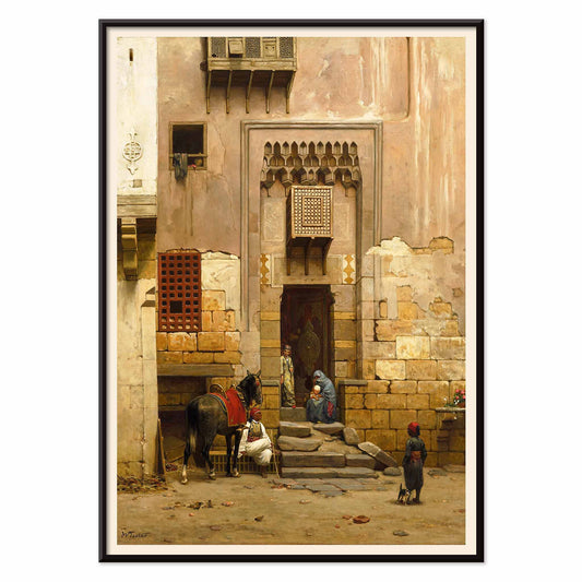
El pati d'una casa al Caire Pòster
Willem de Famars Testas · 1864 · Impressió d'art del pati del Caire amb figures, cavall i ombres arquitectòniques càlides
Poster from €9 · Framed from €16
Regular price From €6,00Regular price -
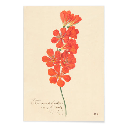
Tritonia Crocata (freesia flamejant) Pòster
Hendrik Cornelis Schwegman · 1892 · Exuberant impressió botànica de freesia flamejant amb tiges arquejades i fulles primes verdes
Poster from €9 · Framed from €16
Regular price From €6,00Regular price -
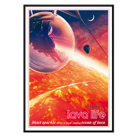
Lava Life Pòster
Sophia Kolinas · 2022 · Pòster retrofuturista amb una càpsula d'observació sobre un mar de lava d'exoplaneta
Poster from €9 · Framed from €16
Regular price From €6,00Regular price -
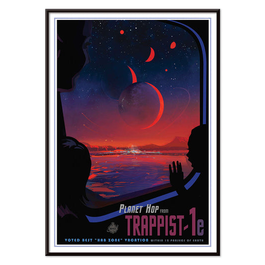
TRAPPIST-1e pòster
Robert Hurt · 2017 · Pòster espacial futurista que mostra una vista d'exoplaneta de cel vermell emmarcada com una finestra d'astronauta
Poster from €9 · Framed from €16
Regular price From €6,00Regular price -
Tres lliris grocs Pòster
Maria de Gijselaar · 1909 · Elegant impressió d'art de tres lliris grocs amb tiges gracioses i estams vermellosos càlids
Poster from €9 · Framed from €16
Regular price From €6,00Regular price -
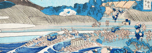
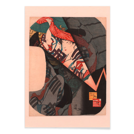
Tempesta sobtada Pòster
Utagawa Sadahide · 1862 · Pòster dramàtic de pluja amb figures acorralades sota un teixit estampat i llamps
Poster from €9 · Framed from €16
Regular price From €6,00Regular price -
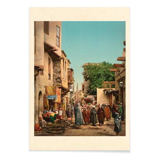
Escena de carrer al nord d'Àfrica Pòster
Edwin Lord Weeks · 1927 · Pòster de carrer al nord d'Àfrica il·luminat pel sol amb tons terrosos i ombres blaves
Poster from €9 · Framed from €16
Regular price From €6,00Regular price -
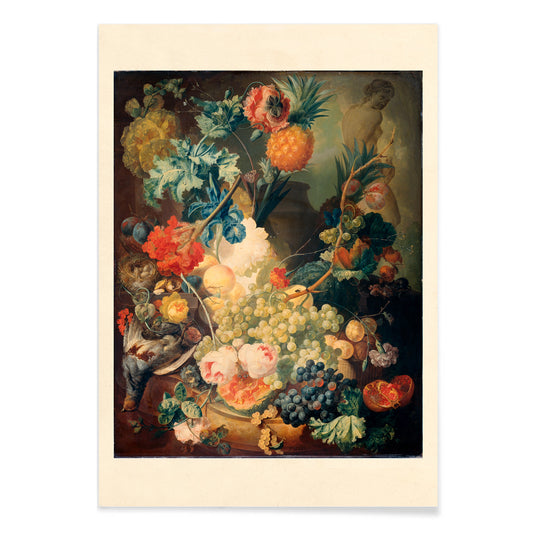
Flors, fruites i ocells Pòster
Jan van Os · 1777 · Rica impressió d'art de natura morta amb flors, fruita madura i ocells petits
Poster from €9 · Framed from €16
Regular price From €6,00Regular price -
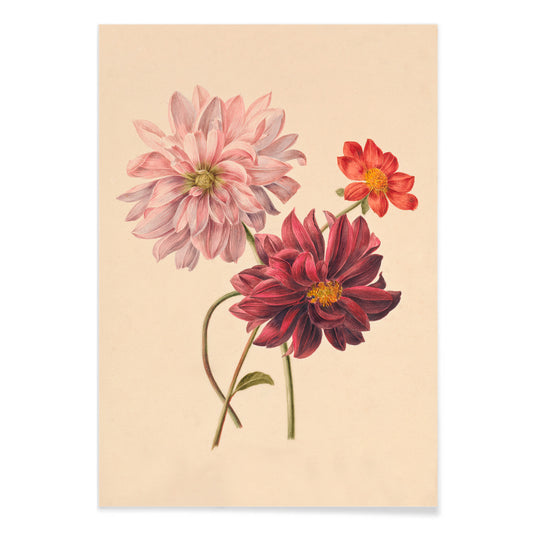
Dàlies Pòster
Willem Hekking Jr. · 1838 · Impressió botànica refinada de dàlia amb pètals en capes i verds suaus
Poster from €9 · Framed from €16
Regular price From €6,00Regular price -
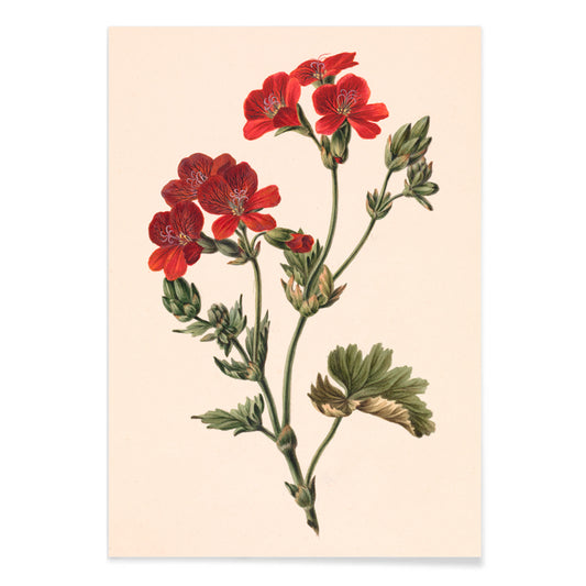
Flor vermella Pòster
Margaretha de Gijselaar · 1917 · Elegant impressió d'art botànica d'una flor vermella amb fullatge verd i fons beix
Poster from €9 · Framed from €16
Regular price From €6,00Regular price -
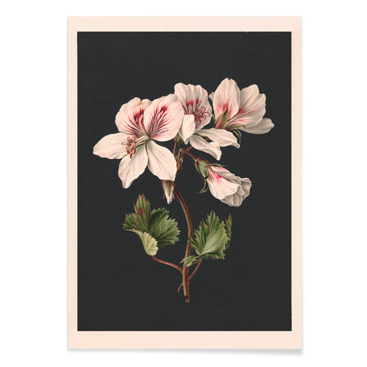
Pelargonium Pòster
Maria de Gijselaar · 1815 · Refinada impressió de pelargonium amb flors blanques sobre fons negre dramàtic
Poster from €9 · Framed from €16
Regular price From €6,00Regular price -
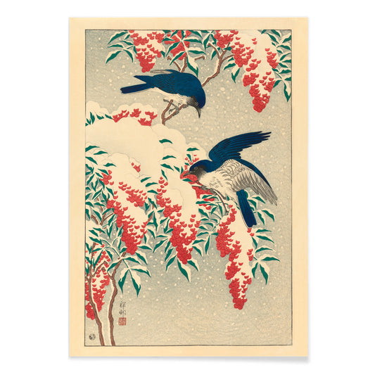
Flors de nandina Pòster
Ohara Koson · 1910 · Elegant impressió d'art amb dos ocells atrapa-mosques entre baies de nandina amb neu
Poster from €9 · Framed from €16
Regular price From €6,00Regular price -
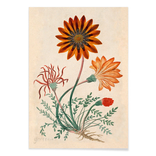
Gorteria diffusa Pòster
Robert Jacob Gordon · 1779 · Impressió botànica viva de tipus margarida amb flors taronja-vermelles i fullatge verd
Poster from €9 · Framed from €16
Regular price From €6,00Regular price


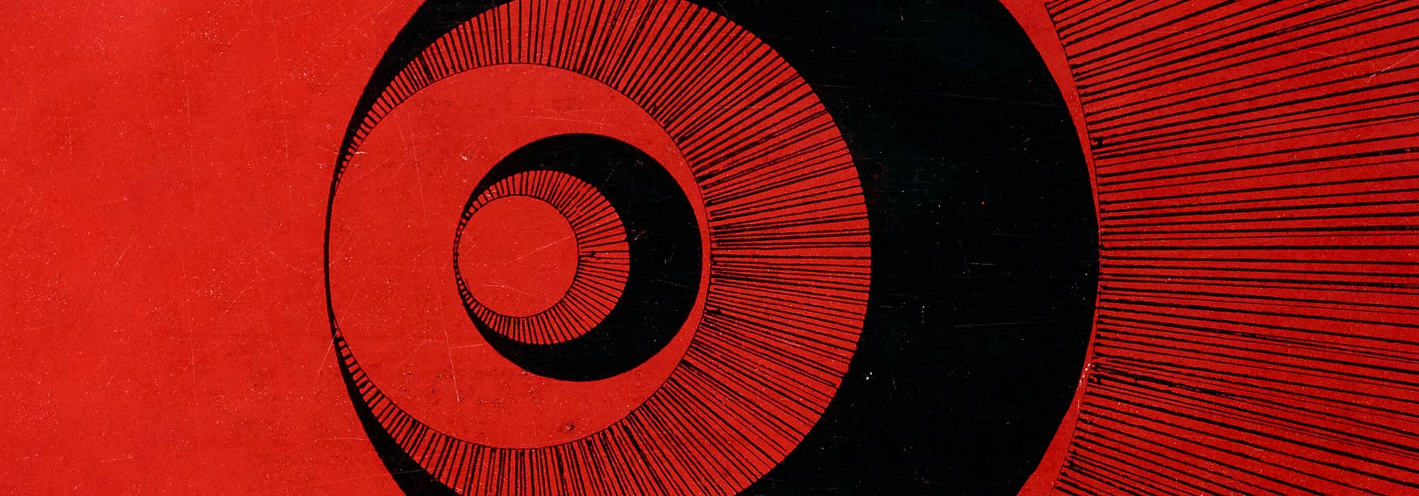
Red as a thread through visual history
Red isn’t just a color; it’s a signal. In this collection, red appears as pigment, ink, dye, and printing choice across eras, from nineteenth-century ornament to twentieth-century modernism. Think of it as a filter for posters and art print classics where crimson, vermilion, and oxblood do the compositional work: pulling your eye to a corner, sharpening a silhouette, warming a pale ground. Because these are vintage images, the reds are rarely “flat” digital scarlet; they’re more often brick, berry, or faded cinnabar, the kind of wall art that feels lived-in as decoration.
Pattern, appetite, and modern structure
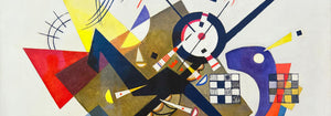
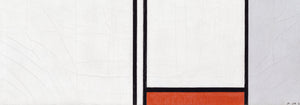
Start with William Morris, whose reds were designed for domestic life, not white-cube walls. Strawberry Thief (1883) by William Morris layers birds and fruit in a dense rhythm that reads like textile, yet holds up beautifully as a poster on its own. A different kind of red discipline arrives with De Stijl: Composition in White, Red, and Yellow (1936) by Piet Mondrian uses a single red plane as a structural counterweight, making the whole print feel calibrated. And when the red becomes an event, Kandinsky’s exhibition language is a masterclass: Heavy Red - Bauhaus exhibition (1924) by Wassily Kandinsky treats color like motion, not ornament.
How to use red wall art without overwhelming a room
Red works best when you decide what it’s doing: warming, punctuating, or anchoring. In a living room with oak, walnut, or terracotta textiles, choose muted reds and let them echo clay, leather, and aged brass. In cooler spaces, let red act as the single “human” note against grey plaster and chrome; one strong print can replace a whole palette. Kitchens and dining areas can handle higher saturation, especially if you already gravitate toward advertising graphics. For calmer rooms, borrow restraint from minimalist or black & white collections, using red as the only interruption.
Curating a gallery wall: companions, frames, and texture
Red is sociable on a gallery wall, but it likes good neighbors. Pair Morris-style surfaces with natural companions from botanical to keep the mood tactile and domestic. Put geometry next to geometry: a Mondrian or Kandinsky sits comfortably beside abstract prints, where repeated shapes make the color feel intentional rather than loud. For framing, black frames sharpen red into graphic design; light oak softens it into home decor. If you want a statement with period attitude, Job (1896) by Alphonse Mucha brings smoky lines and poster-era typography that can “hold” red without needing anything else.
A closing note on red as decoration
People often think red demands commitment, but vintage red is surprisingly forgiving: it arrives with paper tone, ink grain, and historical context built in. Used sparingly, a red print can function like lipstick in an outfit or a single glass of Campari at the table: not necessary, but clarifying. That’s the quiet pleasure of this collection—posters where the color isn’t a trend, it’s a compositional idea.