


- Destroy This Mad Brute Pòster
- Shaw or Irony Pòster
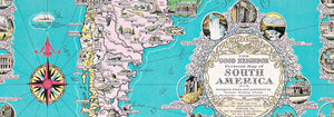
- El bon veí d'Amèrica del Sud Pòster
- Itàlia amb Ciutat del Vaticà Pòster
- Cebes Pòster
- Raves Pòster
- Pastanagues Pòster
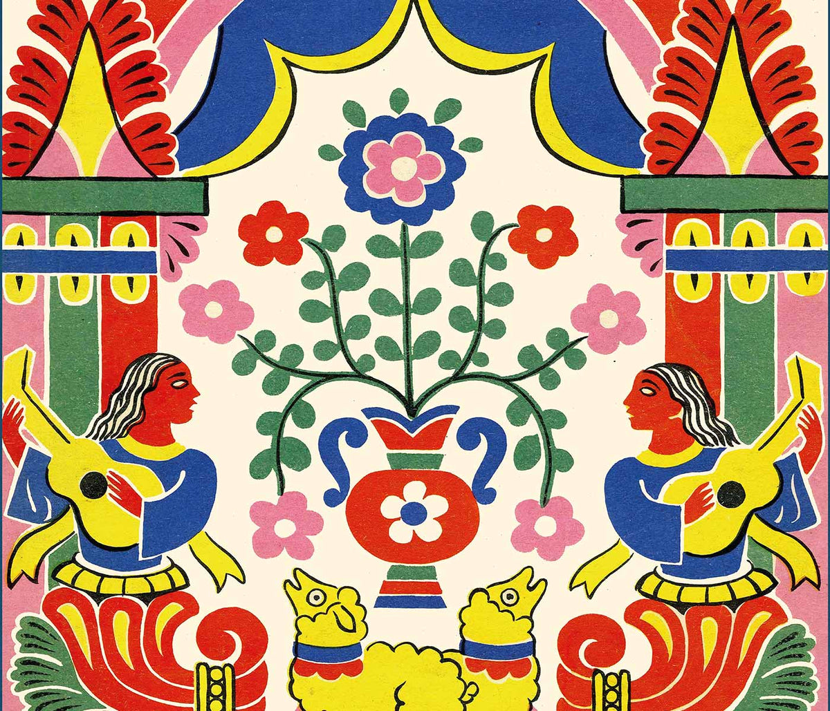
- Les Lalanne Pòster
- Punch Boutique Pòster
- Parella ballant a la neu Pòster
- Judaisme i paganisme Pòster
- Jet Clipper a Hawaii Pòster
- Campari Soda Pòster
- Bec-Kina Pòster
- Kohler Chocolat Pòster
- Strawberry Thief Pòster
- Figures ballant de Matisse Pòster
- Exposició Tom Krojer Pòster
- Escena de carrer de Berlín Pòster
- Exposició Ernst Kirchner pòster
- Torre Eiffel 2 Pòster
- Dona asseguda d'esquena Pòster
- Cabell vermell, barret blau Pòster
- Parc prop de Lu Pòster
- El Comienzo Pòster
- Parler Seul 2 Pòster
- El punt de vista actual dels Mahatmas Pòster
- Anell del crepuscle Pòster
- Parler Seul Pòster
-
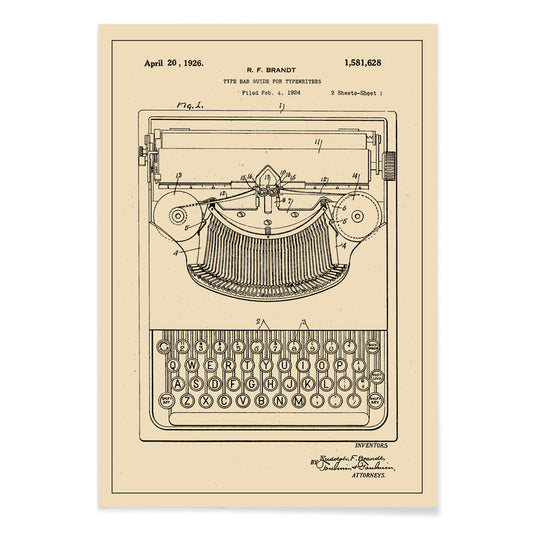
Patent de màquina d'escriure Pòster
Robert F. Brandt · 1878 · Impressió precisa del mecanisme d'una màquina d'escriure amb diagrames etiquetats en un to beix càlid
Poster from €9 · Framed from €16
Regular price From €6,00Regular price -
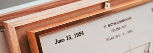
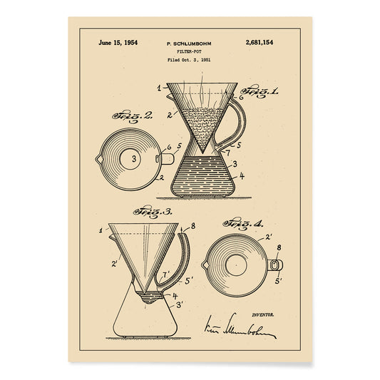
Patent de gerro filtrador de cafè Pòster
Peter Schlumbohm · 1958 · Impressió vintage tipus patent de la cafetera Chemex amb dibuixos tècnics clars
Poster from €9 · Framed from €16
Regular price From €6,00Regular price -
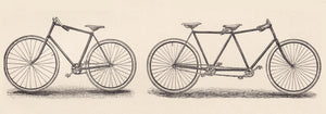
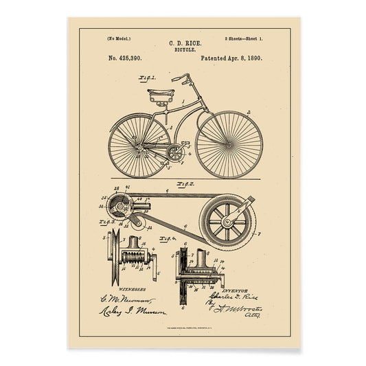
Patent de bicicleta Pòster
Charles D. Rice · 1896 · Impressió de patent de bicicleta detallada amb diagrames tècnics en negre sobre beige
Poster from €9 · Framed from €16
Regular price From €6,00Regular price -
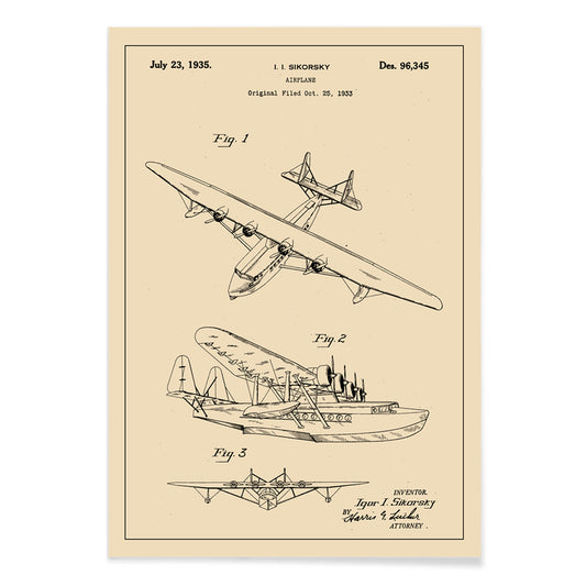
Patent d'avió Pòster
Igor Ivanovich Sikorsky · 1910 · Precisa impressió de patent d'avió amb esquemes multivista en traç negre nítid
Poster from €9 · Framed from €16
Regular price From €6,00Regular price -
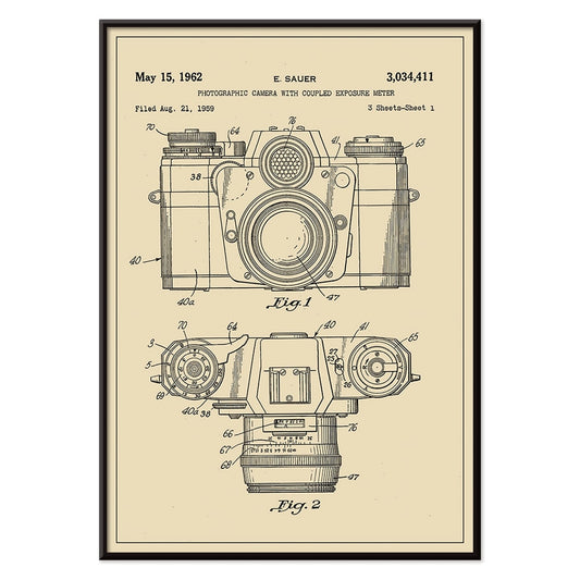
Patent de càmera fotogràfica Pòster
E. Sauer · 1935 · Pòster patent de càmera precís amb dibuixos lineals nítids sobre paper beix càlid
Poster from €9 · Framed from €16
Regular price From €6,00Regular price -
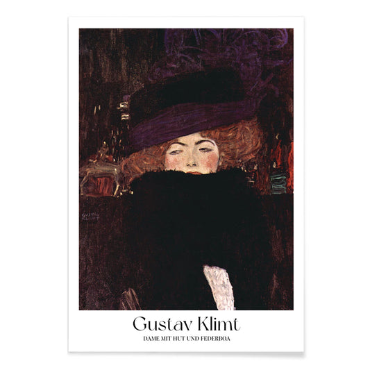
Dona amb barret i boa pòster
Gustav Klimt · 1909 · Elegant impressió d'art de moda amb barret dramàtic i boa de plomes
Poster from €9 · Framed from €16
Regular price From €6,00Regular price -
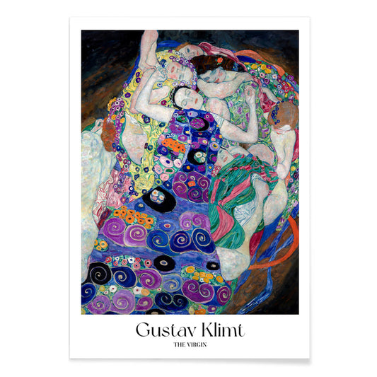
La Verge Pòster
Gustav Klimt · 1913 · Pòster simbolista sensual de dones entrellaçades que floten en una espiral violeta de patrons
Poster from €9 · Framed from €16
Regular price From €6,00Regular price -
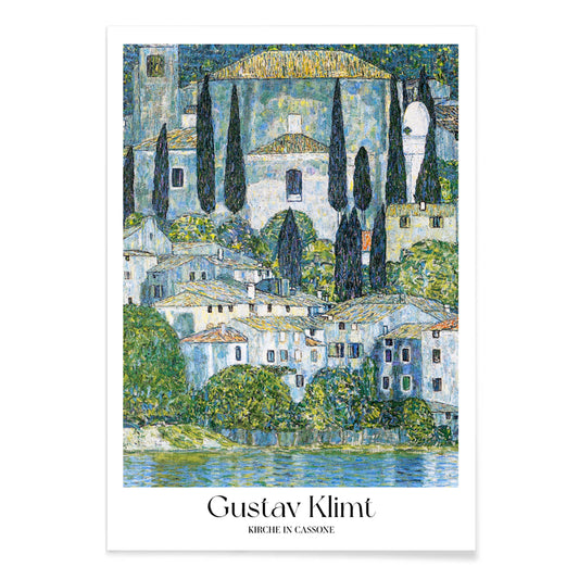
Kirche in Cassone Pòster
Gustav Klimt · 1913 · Impressió d'art de l'església al llac amb reflexos lluents i blocs de color mosaic
Poster from €9 · Framed from €16
Regular price From €6,00Regular price -
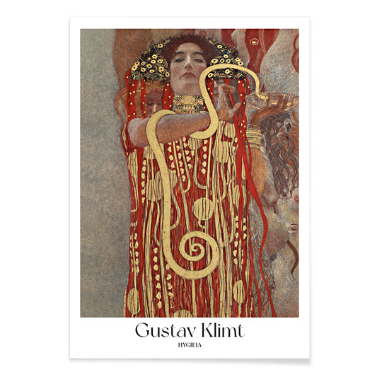
Hygieia Pòster
Gustav Klimt · 1907 · Pòster mític i opulent amb Hygieia en robes ornamentals daurades i serp enroscada
Poster from €9 · Framed from €16
Regular price From €6,00Regular price -
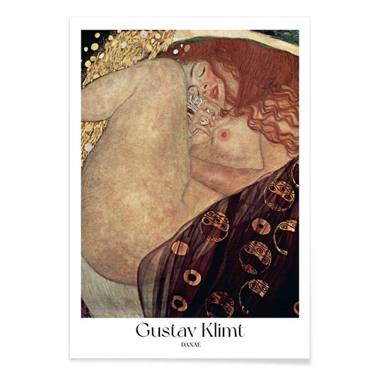
Danae Pòster
Gustav Klimt · 1908 · Brillant impressió d'art simbolista de Danae abraçada per una pluja daurada i ornaments
Poster from €9 · Framed from €16
Regular price From €6,00Regular price -
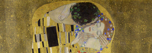
The Kiss Pòster
Gustav Klimt · 1908 · Impressió d'art daurada i lluminosa d'una parella abraçada amb robes estampades
Poster from €9 · Framed from €16
Regular price From €6,00Regular price -
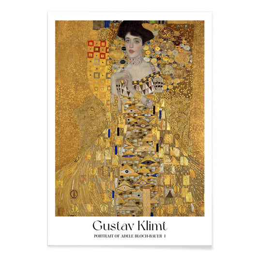
Retrat d'Adele Bloch-Bauer I Pòster
Gustav Klimt · 1907 · Impressió d'art modernista amb daurats, mosaics intricats i mirada serena
Poster from €9 · Framed from €16
Regular price From €6,00Regular price -
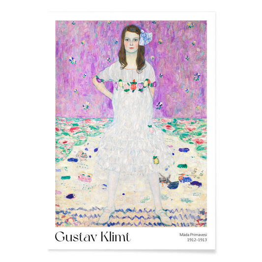
Mäda Primavesi Pòster
Gustav Klimt · 1913 · Impressió d'art de retrat radiant de Mäda amb vestit estampat entre flors ornamentals
Poster from €9 · Framed from €16
Regular price From €6,00Regular price -
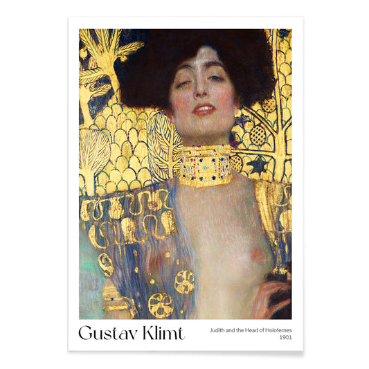
Judit i el cap d'Holofernes Pòster
Gustav Klimt · 1901 · Icònica impressió d'art daurada de Judit amb el cap d'Holofernes en estil Art Nouveau opulent
Poster from €9 · Framed from €16
Regular price From €6,00Regular price -
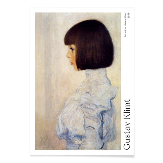
Retrat de l'Helene Pòster
Gustav Klimt · 1898 · Tendre retrat de perfil en impressió d'art amb suau grafit sobre paper beige
Poster from €9 · Framed from €16
Regular price From €6,00Regular price -
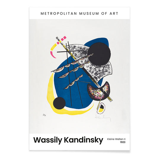
Kleine Welten II Pòster
Wassily Kandinsky · 1922 · Impressió d'art geomètrica i rítmica amb cercles flotants, línies afilades i un fons negre
Poster from €9 · Framed from €16
Regular price From €6,00Regular price -
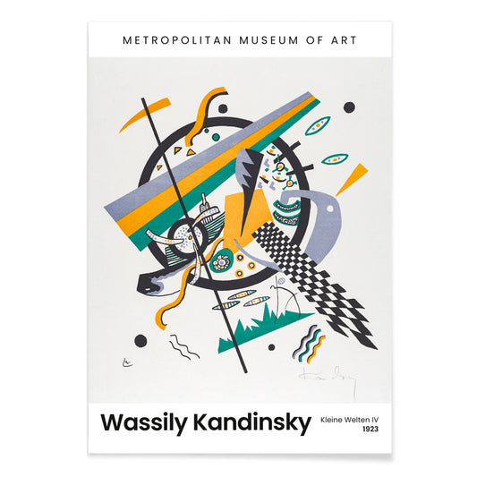
Kleine Welten IV Pòster
Wassily Kandinsky · 1922 · Impressió d'art abstracte de cercles i línies angulars amb accents blau groc verd
Poster from €9 · Framed from €16
Regular price From €6,00Regular price -
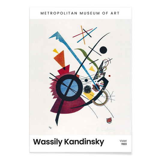
Violet Pòster
Wassily Kandinsky · 1923 · Impressió d'art abstracte geomètrica amb formes violeta, blaves i grogues sobre fons suau
Poster from €9 · Framed from €16
Regular price From €6,00Regular price -
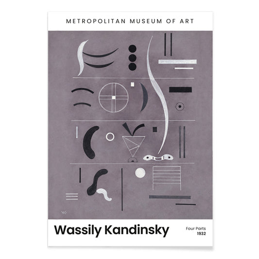
Quatre parts Pòster
Wassily Kandinsky · 1932 · Impressió d'art abstracta dividida en quatre camps de línies i formes nítides
Poster from €9 · Framed from €16
Regular price From €6,00Regular price -
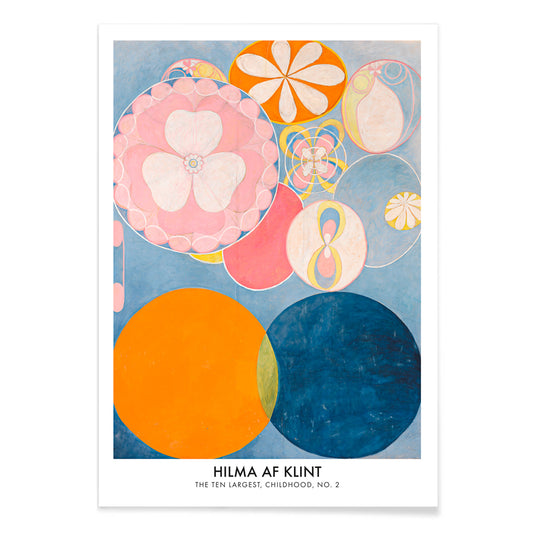
The Ten Largest, Infància No 2 Pòster
Hilma af Klint · 1907 · Lluminosa impressió d'art abstracte amb formes enrotllades en blau, rosa, taronja i groc
Poster from €9 · Framed from €16
Regular price From €6,00Regular price -
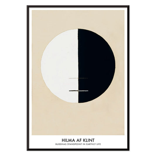
Punt de vista del Buda en la vida primerenca Pòster
Hilma af Klint · 1921 · Impressió d'art meditativa amb un cercle bisectat en negre i blanc sobre beix
Poster from €9 · Framed from €16
Regular price From €6,00Regular price -
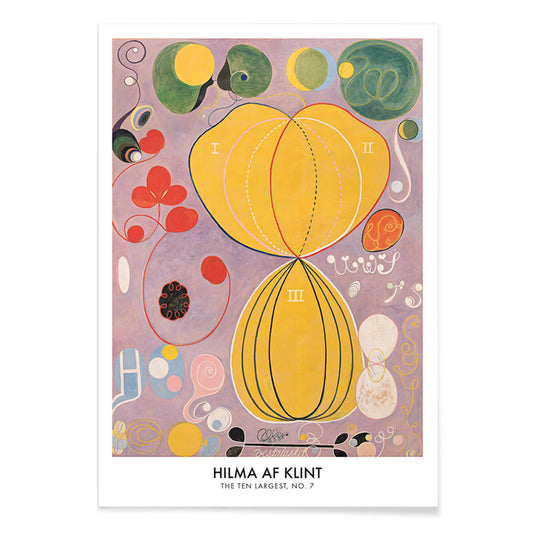
The Ten Largest No 7 Pòster
Hilma af Klint · 1907 · Impressió d'art radiant de formes biomòrfiques sobre un fons groc
Poster from €9 · Framed from €16
Regular price From €6,00Regular price -
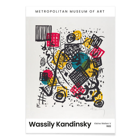
Kleine Welten V Pòster
Wassily Kandinsky · 1922 · Rítmic pòster geomètric de cercles i línies nítides sobre fons negre profund
Poster from €9 · Framed from €16
Regular price From €6,00Regular price -
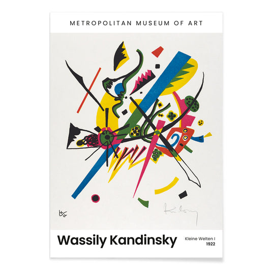
Kleine Welten I Pòster
Wassily Kandinsky · 1922 · Pòster abstracte geomètric que equilibra cercles, línies i brillants accents primaris sobre fons blanc
Poster from €9 · Framed from €16
Regular price From €6,00Regular price -
La Selva Equatorial Pòster
Henri Julien Félix Rousseau · 1909 · Pòster de selva amb capes de fullatge verd i animals amagats que s'esmunyen
Poster from €9 · Framed from €16
Regular price From €6,00Regular price -
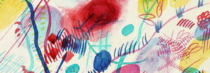
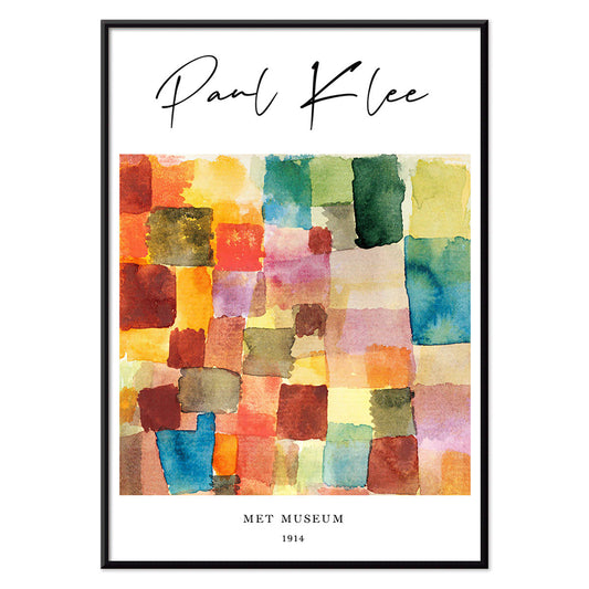
Patchwork de colors Pòster
Paul Klee · 1914 · Impressió d'art abstracta de quadrats patchwork amb vermells i blaus
Poster from €9 · Framed from €16
Regular price From €6,00Regular price -
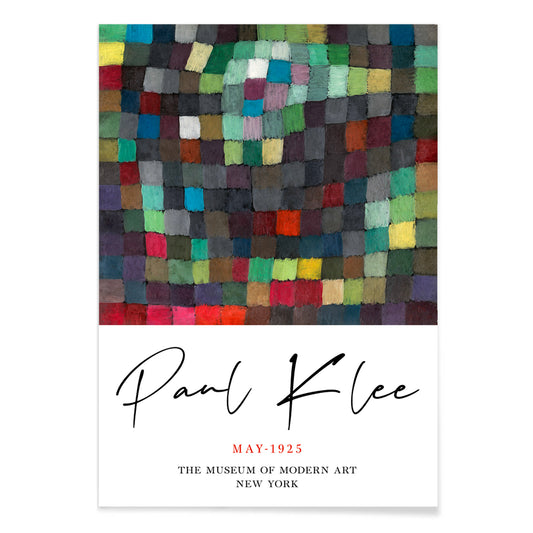
Imatge de maig Pòster
Paul Klee · 1925 · Jocós pòster abstracte amb blocs de color rítmics equilibrats per fines línies negres
Poster from €9 · Framed from €16
Regular price From €6,00Regular price -
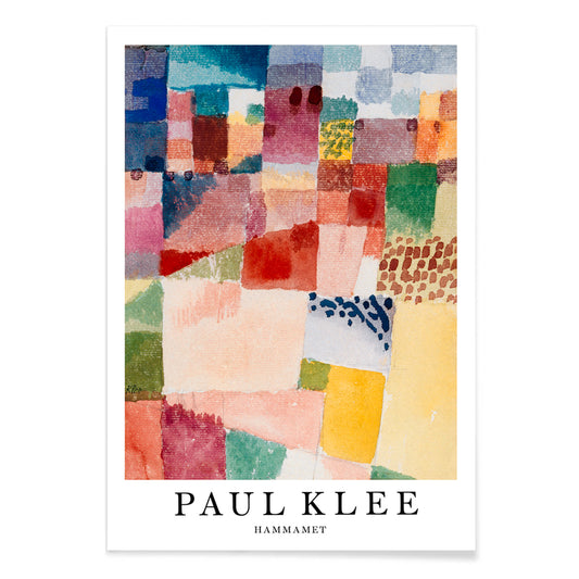
Hammamet Pòster
Paul Klee · 1914 · Radiant impressió d'art abstracta que evoca Hammamet amb mosaics vermell blau i groc
Poster from €9 · Framed from €16
Regular price From €6,00Regular price -
Planta reina Pòster
Philip Reinagle · 1807 · Impressió botànica romàntica amb una flor reina vermella en un ampli paisatge
Poster from €9 · Framed from €16
Regular price From €6,00Regular price -
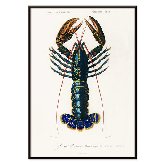
Escamarlà carmí (Palemon Ornatum) Pòster
Charles Dessalines D'Orbigny · 1849 · Impressió científica detallada d'un crustaci carmí amb antenes llargues i traç lineal naturalista
Poster from €9 · Framed from €16
Regular price From €6,00Regular price -
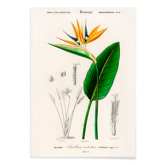
Ocell del paradís Pòster
Charles Dessalines D'Orbigny · 1876 · Impressió botànica de l'ocell del paradís amb flor escultòrica i fulles llargues
Poster from €9 · Framed from €16
Regular price From €6,00Regular price -
Pi marítim Pòster
Charles Dessalines d'Orbigny · 1855 · Impressió botànica detallada de pi marítim amb agulles agrupades i estudis de pinassa
Poster from €9 · Framed from €16
Regular price From €6,00Regular price -
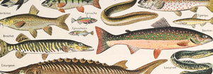
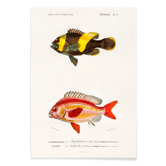
Tipus de peixos Pòster
Charles Dessalines d'Orbigny · 1841 · Impressió d'art naturalista de peixos amb traç nítid i coloració manual subtil
Poster from €9 · Framed from €16
Regular price From €6,00Regular price -
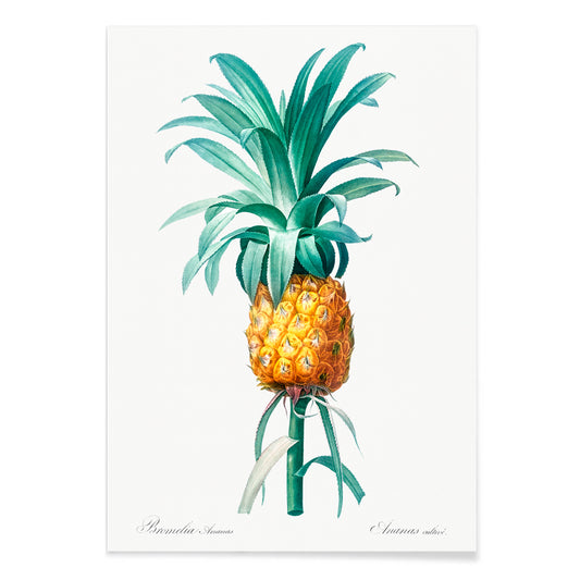
Pinya Pòster
Pierre-Joseph Redouté · 1805 · Refinada impressió de pinya amb detall botànic nítid i tons verd-groc
Poster from €9 · Framed from €16
Regular price From €6,00Regular price -
Flor de cirerer Pòster
Kazumasa Ogawa · 1892 · Delicada impressió vintage de flor de cirerer amb pètals tenyits a mà i atmosfera primaveral serena
Poster from €9 · Framed from €16
Regular price From €6,00Regular price -
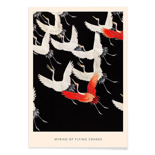
Miríada de grulles en vol Pòster
Katsunosuke Kuroki · 1915 · Pòster de grulles en vol en vermell, negre i blanc amb ritme
Poster from €9 · Framed from €16
Regular price From €6,00Regular price


- Patent de màquina d'escriure Pòster
- Patent de gerro filtrador de cafè Pòster
- Patent de bicicleta Pòster
- Patent d'avió Pòster
- Patent de càmera fotogràfica Pòster
- La Verge Pòster
- Hygieia Pòster
- The Kiss Pòster
- Retrat d'Adele Bloch-Bauer I Pòster
- Judit i el cap d'Holofernes Pòster
- Retrat de l'Helene Pòster
- Kleine Welten IV Pòster
- Violet Pòster
- Quatre parts Pòster
- The Ten Largest, Infància No 2 Pòster
- Punt de vista del Buda en la vida primerenca Pòster
- The Ten Largest No 7 Pòster
- Kleine Welten I Pòster
- La Selva Equatorial Pòster
- Patchwork de colors Pòster
- Hammamet Pòster
- Escamarlà carmí (Palemon Ornatum) Pòster
- Tipus de peixos Pòster
- Pinya Pòster
- Miríada de grulles en vol Pòster
Why vertical posters change a room
A vertical poster behaves like an architectural element: it draws the eye upward, narrows visual noise, and gives small rooms a clearer sense of proportion. Portrait-oriented formats have long been used for theatre bills, book covers, and street notices, where the tall rectangle supports a paced, top-to-bottom read. As wall art, that same structure can steady busy interiors and make circulation spaces feel composed. It is a useful format for entryways, corridors, and the slim wall between window and shelving, where a horizontal print would feel interrupted.
Graphic heritage and what it teaches the eye
The vertical format grew up in public view. Travel announcements, cinema programs, and commercial lithography trained designers to manage hierarchy with precision: headline, image, fine print, all balanced by margins. The best vintage posters carry this discipline into today, whether they are typographic or purely pictorial. Flat colour fields and crisp outlines help a composition read from a distance, while paper texture and ink density reward a closer look. The same logic links naturally to Bauhaus clarity, to the reduced forms of Minimalist design, and to the strong tonal scaffolding found in Black & White imagery.
Placing portrait wall art room by room
In living rooms, a tall print works well beside a bookcase, cabinet, or floor lamp, where it echoes the verticals already present in furniture. In bedrooms, portrait posters settle comfortably on the narrow strip between wardrobe and door, or as a single accent offset from the bed rather than centered over it. Kitchens and dining nooks often suit graphic vintage pieces, especially label-inspired layouts from Advertising, while quieter botanical studies from Botanical can soften hard surfaces like tile and steel. For colour, treat the poster as your accent note: pull one ink colour into linens or ceramics, then keep the surrounding wall and frame finishes restrained so the rectangle reads cleanly.
Curating pairs, framing, and gallery wall rhythm
Vertical prints are easiest to live with when curated in pairs: one image-dense sheet beside a calmer field so the wall alternates between detail and pause. A third element can widen the composition, such as a horizontal counterpoint from Landscape, but keep the spacing consistent so the arrangement feels deliberate. Thin black frames sharpen graphic designs; oak or walnut adds warmth to archival imagery, and coordinated options sit in Frames. Use a narrow mat to give darker prints breathing room, especially in smaller formats, and hang by a shared centerline at eye level while letting top edges step subtly to preserve the vertical rhythm.
The calm logic of a tall rectangle
Format-led collections stay flexible: portrait orientation can hold architectural photos, symbolic studies, abstraction, or vintage typography without forcing a single mood. What unites these posters is the way the tall crop edits a scene, keeping gesture and negative space in balance. When home decor starts to feel crowded, one considered vertical art print can restore order more effectively than a cluster. Treated as a single, quiet opening on the wall, it lets the room breathe while still offering a clear focal point.