


-

"Very nice Posters. The quality is amazing and we received it very quickly !"
-

"A shop to visit absolutely. Huge selection of posters. We spent more than an hour there !"
-

"Perfect to find gift. Price are very good. An they can frame and pack it on site"


About the Artist
Karl Wiener was an Austrian modernist whose career unfolded in the dynamic artistic circles of interwar Vienna. He explored the boundaries of abstraction, drawing inspiration from the period’s fascination with how pure form and color could express ideas beyond traditional representation. Wiener’s work reflects the spirit of early twentieth-century European innovation, where artists and designers sought new visual languages for a rapidly changing world.
If you are interested in the evolution of modernist abstraction, you may also appreciate our famous artists collection and the pioneering experiments of Wassily Kandinsky.
The Artwork
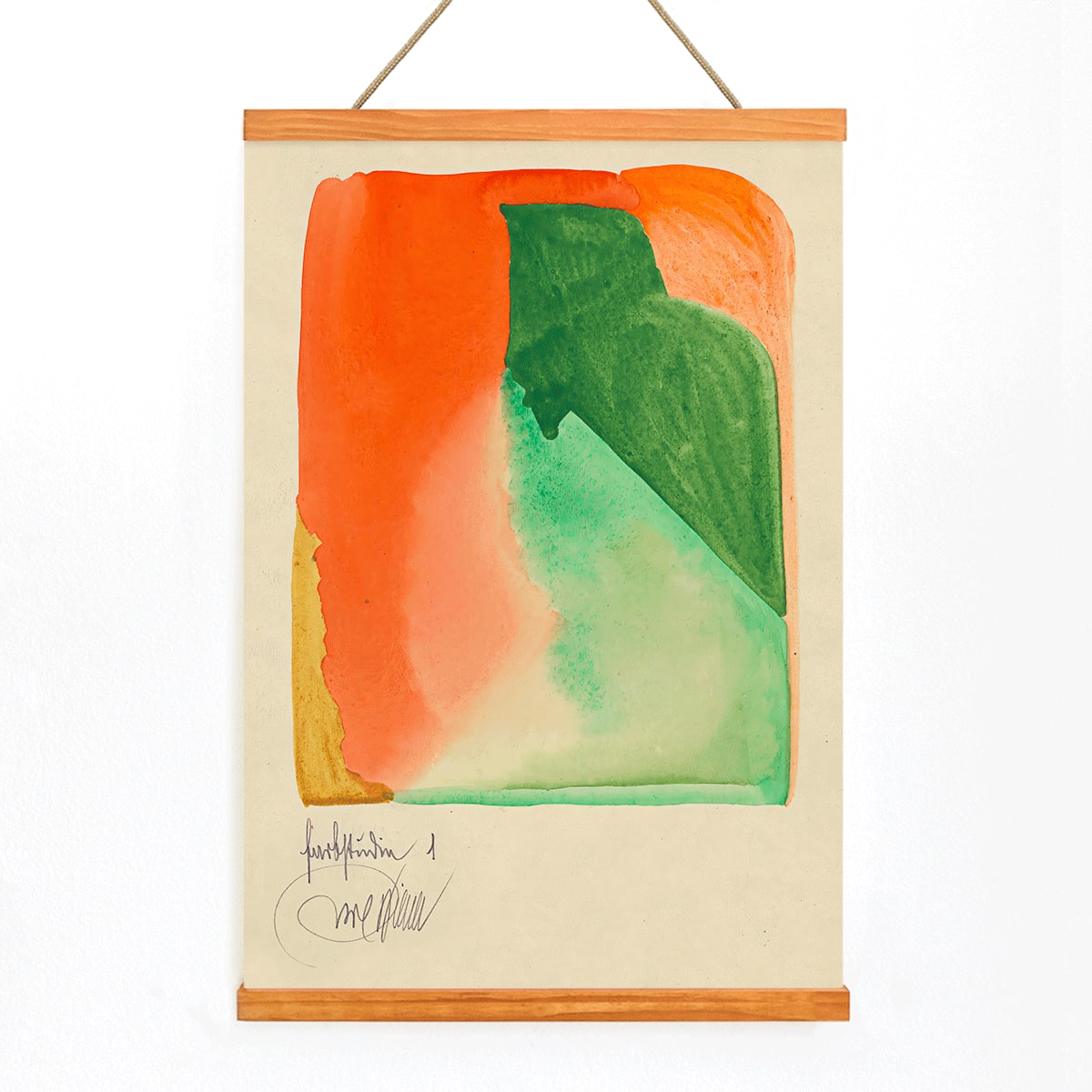
Farbstudien, 10 Blätter I was created as part of a series of color studies, typical of the pedagogical exercises that shaped modernist art education in the 1920s. Rather than depicting recognizable subjects, Wiener’s study investigates how color relationships and geometric arrangements can evoke rhythm, balance, and visual energy. Such works were often used as teaching tools, encouraging viewers and students to focus on the fundamental elements of design.
This vintage print embodies the era’s belief that art, architecture, and design could share a common visual language, reflecting a time when creative disciplines were increasingly interconnected.
Style & Characteristics
The artwork features a carefully arranged composition of flat, geometric forms in orange and green, set against a warm beige background. Darker accents define the edges and create a sense of structure, while the overall layout is asymmetrical yet harmonious. The surface is smooth and clean, emphasizing clarity and intentionality rather than expressive brushwork.
The mood is lively and optimistic, with the interplay of colors creating a sense of movement and musicality. As an abstract art print, it offers a striking visual statement that remains approachable and versatile for many interiors.
In Interior Design
This modern abstract poster is well suited for spaces like home offices, hallways, or creative studios where energy and structure are valued. Its orange and green palette complements light woods, black metal, and warm neutrals, and it can add vibrancy to minimalist interiors that favor simple forms and calm surfaces.
For a cohesive look, consider pairing it with other abstract posters or building a palette from our orange tones collection. It appeals to admirers of Bauhaus-era design and those seeking graphic wall decor with historical resonance.