


-

"Very nice Posters. The quality is amazing and we received it very quickly !"
-

"A shop to visit absolutely. Huge selection of posters. We spent more than an hour there !"
-

"Perfect to find gift. Price are very good. An they can frame and pack it on site"


About the Artist
Joseph Gibbons Richardson was an early 20th-century illustrator whose work bridged the gap between art and education. In 1910, as visual aids became increasingly important in classrooms and public instruction, Richardson contributed to the era’s focus on clarity and accessibility. His instructional diagrams reflect a commitment to making information visually intuitive, supporting both teachers and independent learners.
Richardson’s legacy endures in collections of scientific and educational prints, where illustration serves as a vital tool for understanding. Today, his work is appreciated not only for its historical significance but also for its graphic elegance and enduring relevance.
The Artwork
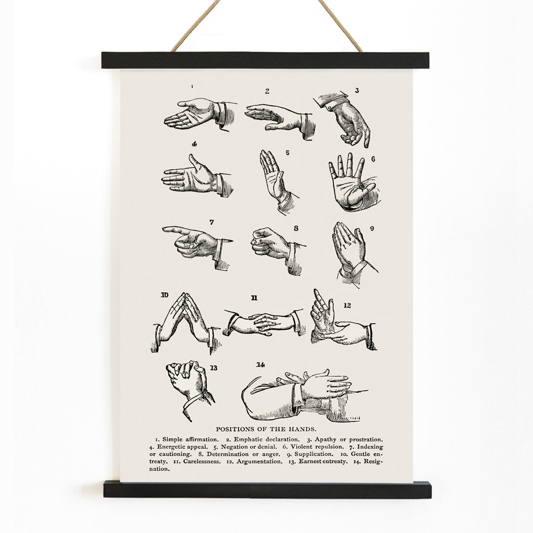
Positions of the Hands was created at a time when sign language was gaining wider recognition and formalization. This instructional chart was designed to provide a clear, standardized reference for hand signs, supporting the education of both deaf and hearing communities. The artwork reflects the early 20th-century movement toward accessible communication and the democratization of knowledge through printed materials.
As a historical document, it highlights the importance of visual systems in bridging gaps and fostering inclusion, making it a meaningful piece for those interested in the evolution of language and education.
Style & Characteristics
The print features a grid of meticulously rendered hands, each isolated for maximum clarity and arranged with typographic precision. The use of sharp black lines against a pale background emphasizes legibility and order, transforming anatomical study into a set of elegant symbols. The overall effect is archival yet modern, with a restrained monochrome palette that underscores its instructional purpose.
This aesthetic aligns with black and white wall art and appeals to those who value structure and minimalism in their decor. The crisp linework and balanced composition give the piece a calm, scholarly atmosphere.
In Interior Design
This vintage sign language print brings both meaning and visual interest to spaces such as home offices, libraries, or creative studios. Its understated design complements minimalist, Scandinavian, or modern classic interiors, especially when paired with natural materials like wood or stone.
To preserve its diagrammatic character, consider a simple frame from the frames collection. The print’s neutral tones make it versatile for gallery walls or as a standalone statement in thoughtful, knowledge-inspired spaces.